A shiny app for Exploratory Qualitative Analysis

This post is to share my (first) R Shiny app, which was produced as a result of a Qualitative analysis project I carried out for the Office of the Police and Crime Commissioner (OPCC), Norfolk, UK. The Shiny app provides users to either upload sample corpora made available with the app, or to simply upload custom corpora. It, then, enables users to

  • Check word distributions from corpora
  • Cluster documents and perform Topic modelling
  • Cluster words and produce word clouds
  • Generate networks of words

The following sections elaborate on the different aspects of this app.

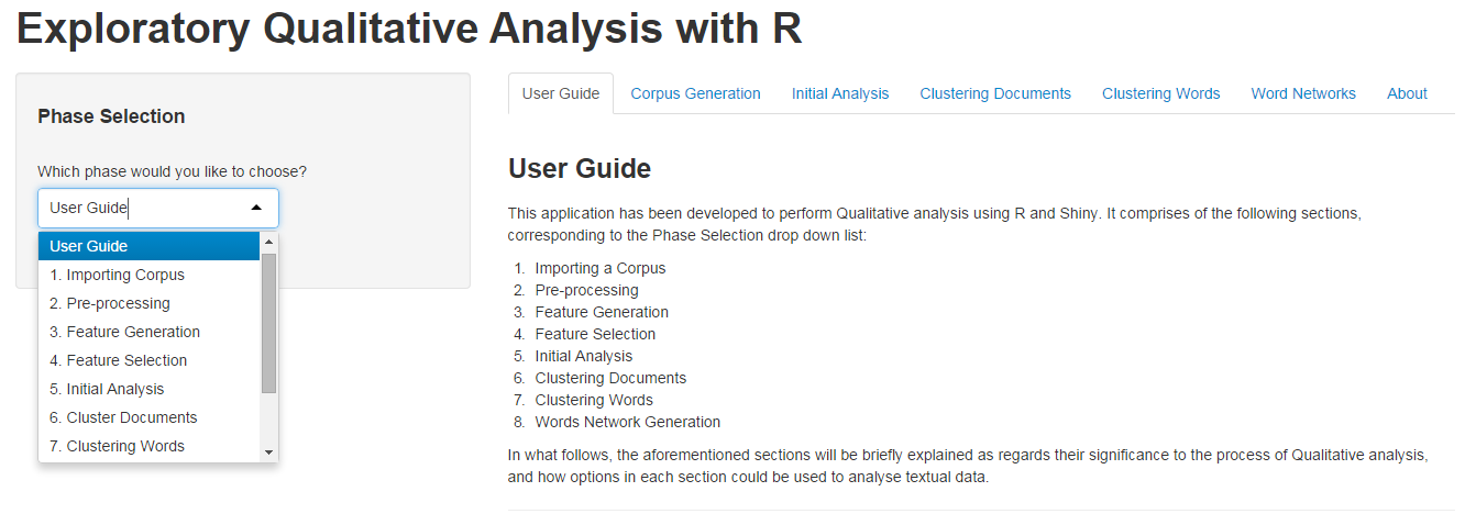
Phase Selection & The User Guide

userGuide

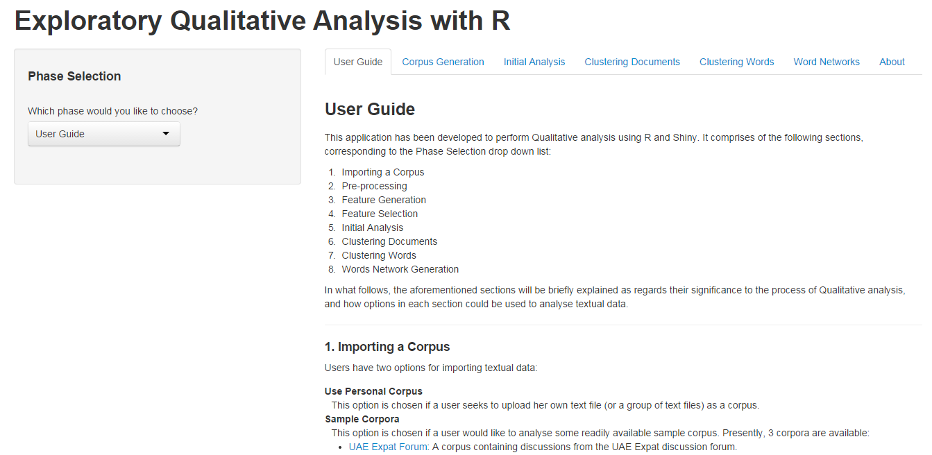
The Phase Selection drop down list enables users to select which phase they want to enter for Qualitative analysis. Although the tabs, being visible, may naturally prompt the user to select any phase by clicking at them, they are not actually meant for this purpose. The purpose of tabs is just to keep separated the different phases in the app, while the Phase Selection list is meant to facilitate users to select a phase of their choice.

phaseSelection

Importing a Corpus

importingCorpus

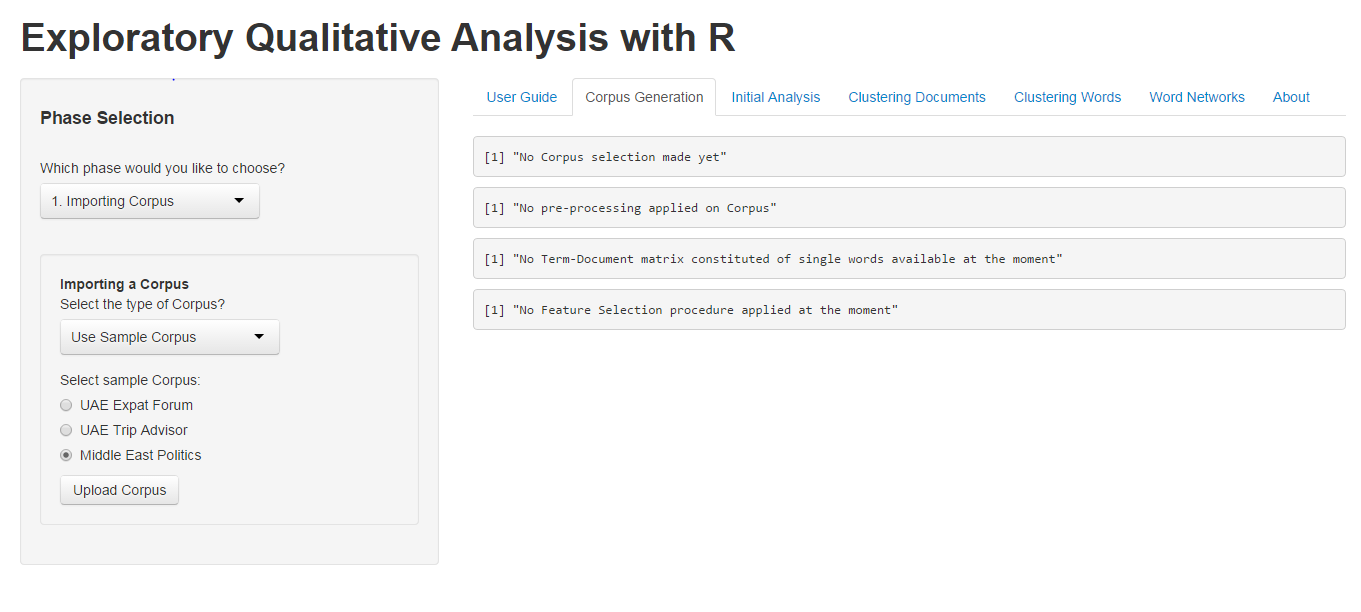
Users have the option of uploading either their custom corpus (which may be a single text file with a new line as a delimiter, or a collection of similar text files), or a sample corpus. Currently, three sample corpora are available for users:

  1. UAE Expat Forum
  2. UAE Trip Advisor
  3. Middle East Politics

These corpora were constructed after performing some web scrapping of discussion forums. The code for web scraping these websites can be found here. For the purpose of demonstration, we shall select the Middle East Politics data set.

After selection, clicking on the ‘Upload Corpus’ button uploads the selected corpus, with a message being displayed in the right panel.

Pre-processing

preProcessing

The Pre-processing phase enables users to perform several basic pre-processing procedures, such as removal of punctuation, numbers, and stopwords. This app also allows users to enter custom stopwords, separated by a comma, as well as custom thesauri, with the same procedure of separating words with commas.

The ‘Apply Pre-processing’ button applies the selected pre-processing procedures to our corpus data.

Feature Generation

featureGeneration

The Feature Generation phase is provided for users to select weighting criteria for words, documents, and a normalisation scheme. Once selected, the ‘Generate Features’ button applies the selected criteria to words and documents.

For this demonstration, I have chosen TF scheme, with no normalisation.

Feature Selection

featureSelection

The Feature Selection phase is an integral part of the app (given how it enables us to cut down on memory being used – memory limitations apply to this app, of course). Users may determine a lower bound for word frequency, or set the allowed sparsity level. The ‘Select Features’ button calculates the new Term Document matrix. We shall set our frequency lower bound to 33, and leave the default value for sparsity level.

Initial Analysis

initialAnalysis

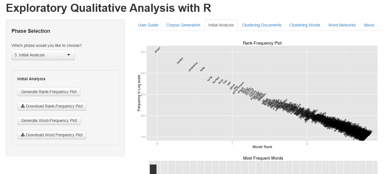
In the Initial Analysis phase, users have the options to plot a Rank Frequency plot, or a Word Frequency plot, both of which are downloadable as PDF files.

Cluster Documents

clusterDocs

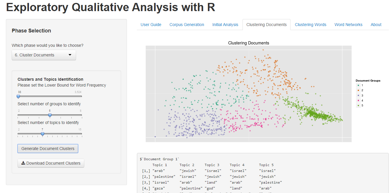
To Cluster documents, users have to select a lower bound for word frequency, the number of documents they want to identify in clustering procedure, as well as the number of topics they wish to identify from the clustered documents. The resulting graph is downloadable as a PDF file.

Clustering Words

clusterWords

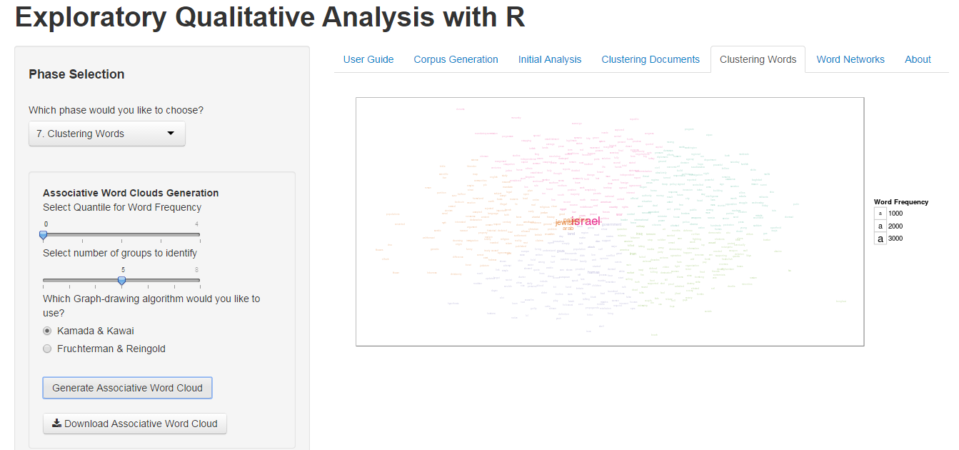
To Cluster words, users select the quantile for word frequency (which has the same purpose as of selecting a lower bound for word frequency), the number of groups they want to form for words, and finally one of the two force-drawing graph algorithms. This graph can also be downloaded as a PDF file.

In addition to the above, users may also create a dendrogram of words, from relevant options made available in the app.

Words Networks

wordsNetwork

This phase can be used to identify relations between words – the association of words to each other is represented by inter-connecting lines, just as in a network. To generate a network of words, users first select the quantile for word frequency, just as in the Word Clustering phase, and then simply select one of the two force-drawing graph algorithms. The ‘Generate Words Network’ button plots the graph, which can also be downloaded as a PDF file.

This phase is also the most memory-intensive phase. I realise that, at time, the plotted network may not be intelligible. Hope to improve it soon.


That completes a walk-through of this app!The app can be accessed from this link.

I would be very eager to hear any generous amount of criticism, or your thoughts in general, about this app.

Many thanks for your time reading through this post!

Inspecting and Exploring Data – Applied Predictive Modelling (Chapter 3)

This post comprises my attempt in answering questions from the 3rd Chapter of the book, Applied Predictive Modelling. The chapter emphasises mostly on inspecting data and transforming appropriately any variables as per requirement. Nevertheless, I have also carried out some exploratory analyses of the variables with respect to the target class.

The data set in question is the Glass Identification data set, and is characterised as follows:

Description

A data frame with 214 observation containing examples of the chemical analysis of 7 different types of glass (of which 1 type has not been recorded), presented through 9 different variables. The data frame contains no missing values.

Variable Information

1. RI: The Refractive Index
2. Na: Sodium (unit measurement: weight percent in corresponding oxide; the same unit for variables 2-9)
3. Mg: Magnesium
4. Al: Aluminium
5. Si: Silicon
6. K: Potassium
7. Ca: Calcium
8. Ba: Barium
9. Fe: Iron
10. Type:
1 building_windows_float_processed
2 building_windows_non_float_processed
3 vehicle_windows_float_processed
4 vehicle_windows_non_float_processed (none in this database)
5 containers
6 tableware
7 headlamps

Data Inspection

We first inspect the target class — the Type variable — to see the distribution of various types of glasses. The following pie chart was obtained.

Figure 1 – Glass Types

Evidently, the first two types of glasses — Building windows float and non-float — account for more than half of the total glasses. A user intending to train a classifier on this data set would, therefore, need to be cautious: any classifier trained would probably predict the first two classes better compared to other classes, such as that of Tableware.

Next, we may check whether the variables follow a normal distribution. This is essential for certain classifiers, such as Logistic Regression, which assume that variables they are being trained are normally distributed. In the following, I created a variable with normal distribution and plotted the distribution of original variables, with the intention of comparing the original variables with the normal distribution.

Figure 2 – Comparing distributions

The plot shows that our variables do not follow the normal distribution. In fact, our variables are expressing different skewness and kurtosis. We may calculate both of these values for each variable: a negative skew value indicates that a variable is left skewed (and vice versa), while a negative kurtosis value indicates that a variable has a flat distribution (and vice versa).

The following plot displays each variable’s distribution, along with the respective skewness, and kurtosis. The different colours indicate our target classes as observed in each distribution.

Figure 3 – Histograms

Logically, we would expect to see the first two glass types most often in the distributions, since these two were found to account for more than half of complete data set. This is apparent from the above graph: clearly, the most easily observed and large classes are the first two — Building windows float and non-float.
I find the above plot to be useful for getting a ‘feel’ of the data. From this plot, we can see that, for example, the Building windows non-float has the widest range of RI, whereas the RI values for Building windows float have a relatively short range. As another example, the Mg variable can be seen to have two different groups: one containing Building windows float and Vehicle windows float, and the other containing Tableware, Containers, and Headlamps. For the Ba variable, two groups are apparent, again: one containing Tableware and another containing the rest of the variables.
From all these histograms, it is clear that Building windows non-float appears to have the widest range of values, while Building windows float appears to have the tightest range.

Where the previous diagram displayed the range of values taken by each type of glass, along with the number of instances belonging to the values, the forthcoming plot stresses only the range of values.

Figure 4 – Line plots

It can be observed from this plot that in case of certain variables, some glass types cover the complete range of possible values, and for others they do not. For example, Building windows non-float and Headlamps have a wide range of values for the Ba variable, implying that using Ba as a predictor for the aforementioned glass types may not be an appropriate choice. The Tableware glass type has a very tight range of values for the variables K, Ba, and Fe. This is interpreted as Tableware having very specific values for the three variables.

Another basic, yet effective tool for exploring data is the Boxplot. The next diagram comprises of boxplots plotted for each variable in our data frame against the target class. These compliment the histograms plot, and insights initially gleaned from histograms can be verified using these boxplots: for the variable Mg, there indeed exist two distinct groups of glass types — that of Building and Vehicle windows, and another containing Containers, Headlamps, and Tableware. Similarly, we can also verify that for the variable Ba, there appear to be two groups again, with one comprising of Tableware, and the other comprising of remaining glass types. Further inspection may reveal additional insights regarding each variable’s distribution.

Figure 5 – Boxplots

A correlation matrix plot can also be used here to picture correlations between pairs of variables. A positive or negative correlation between certain variables may be noteworthy for a data analyst.

Figure 6 – Correlations

Using the plot displayed above, it can be ascertained that the Refractive Index (RI) is inversely proportional to Si and directly proportional to Ca. That is, in our glass samples, as the RI of glasses increased, an increase and a decrease were recorded in the oxide contents for Ca and Si, respectively. Further such findings may be made by studying the remaining correlations individually.

Parallel Coordinates plots may be used to discover if particular types of glass follow particular patterns, or take up specific values for each variable.

Figure 7 – Parallel Coordinates plot

Apparently, glass types that are float processed (Building windows and Vehicle windows) follow a similar pattern for their values across variables. This may be due to the way they are processed. As well, it appears that Building windows non-float and Containers have the widest range of values for the variables.

Finally, to complete our task of Data Inspection, we may want to transform specific variables, as determined by the Box Cox transformations, available from R. Once the transformations have been applied, the skewness and kurtosis of the data prior to and post transformations can be compared.

Figure 8 – Comparing Transformed and Original data

Having performed all the above inspection of my data, I feel content to conclude this post. The entire code used to perform analyses and generate graphs can be found here.